How to Choose Your Wedding Colour Palette
Lucca Studios – Journal Feature
Your wedding colour palette sets the tone for your entire celebration. Long before your guests arrive at your ceremony or take their seats for dinner, your colours begin telling the story of your day, woven through your wedding invitations, florals, tablescape, fashion, and every thoughtful detail in between.
But with endless inspiration online, choosing your wedding colours can feel overwhelming. The most beautiful weddings aren’t necessarily the boldest or most trend-led; they’re the ones that feel cohesive, intentional, and personal.
If you’re wondering how to choose a wedding colour palette that feels romantic and refined, here’s where to begin.
Start With Feeling, Not Colour
Before choosing specific shades, think about how you want your wedding day to feel. Romantic and soft? Modern and editorial? Intimate and candlelit? Effortless and understated? Your colour palette should support the atmosphere you want to create.
Often, couples focus first on a colour they love, but it’s usually the feeling behind the imagery they’re drawn to that matters most. Warm neutrals and layered stone tones create a very different atmosphere to crisp monochrome styling or rich autumnal hues.
Take Inspiration From Your Venue
Your wedding venue already has its own palette, textures, and character and the most cohesive weddings work with these details rather than against them.
A countryside manor may lend itself beautifully to soft taupes, olive greens, and layered neutrals, while a grand city venue might call for something more tonal and refined, such as ivory, black, and champagne gold.
Your wedding colours should feel like an extension of the setting, allowing every detail to sit effortlessly within the space.
Keep Your Palette Refined
One of the biggest mistakes couples make is trying to incorporate too many colours.
A refined wedding colour palette usually consists of:
One dominant colour
One or two supporting tones
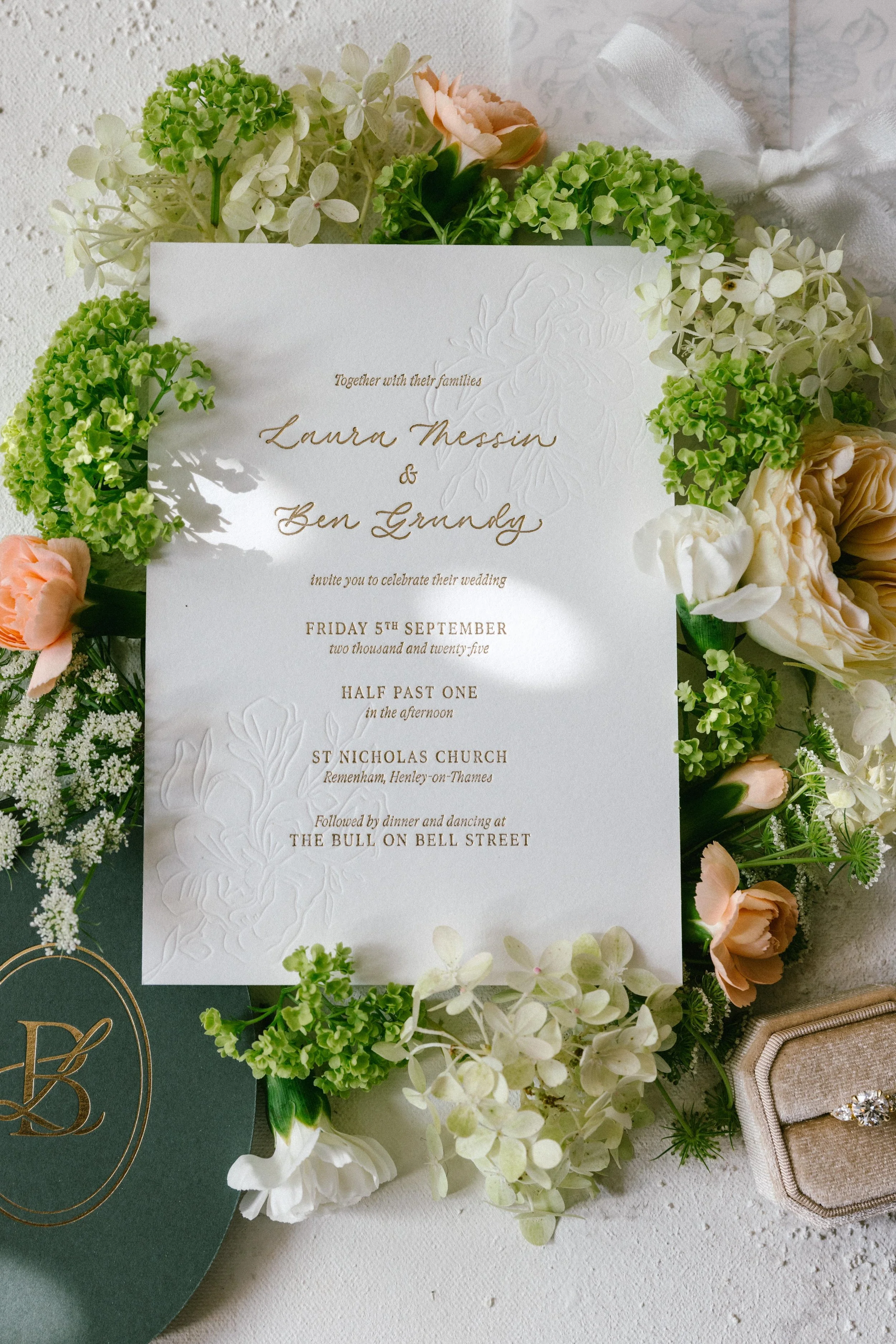
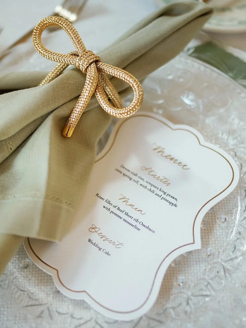
A subtle accent, often this is a metallic, like gold foil on your invitations.
This creates depth and interest without overwhelming the eye.
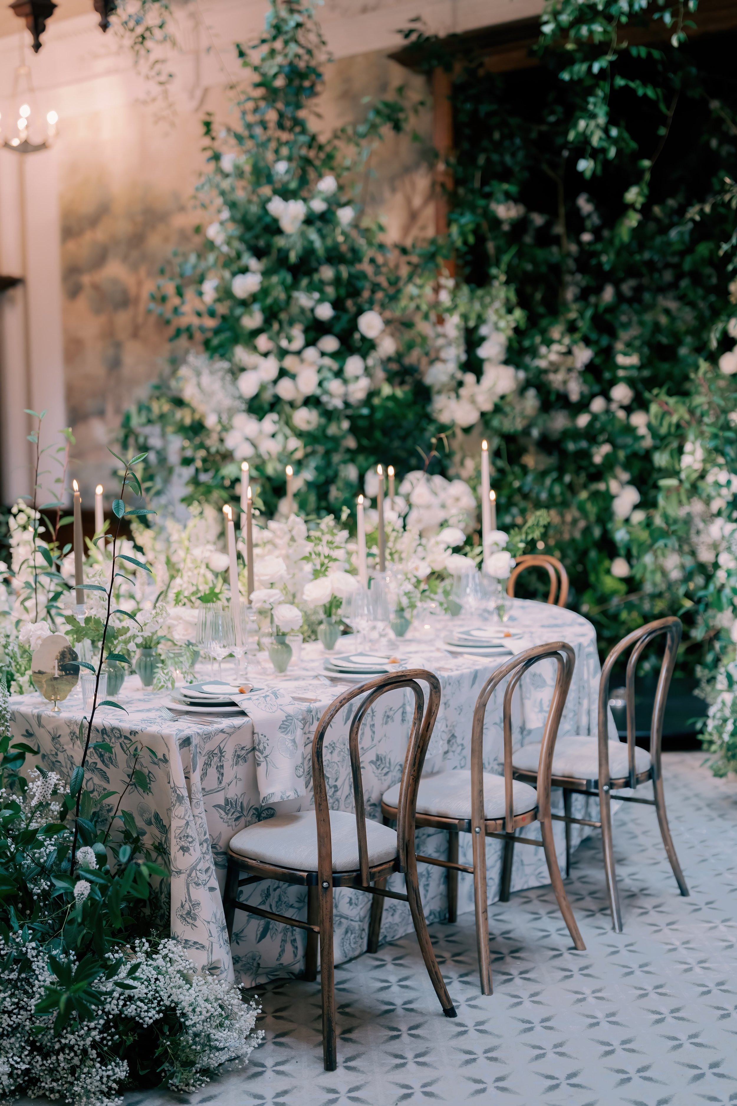
Neutrals are often what make a palette feel elevated. Soft ivories, warm oat tones, stone, chocolate brown, or muted greens bring balance and sophistication while allowing statement details to shine beautifully.
Think Beyond Trends
Wedding trends can be a wonderful source of inspiration, but your wedding should still feel timeless years from now.
Rather than choosing colours simply because they’re popular on Pinterest or Instagram, think about the shades you naturally gravitate towards in your home, wardrobe, and everyday life. These often become the foundation for a palette that feels authentic to you.
Consider the Full Guest Experience
Your wedding colour palette shouldn’t only work within your florals, it should flow seamlessly throughout the entire guest experience.
Think about how your colours will appear across:
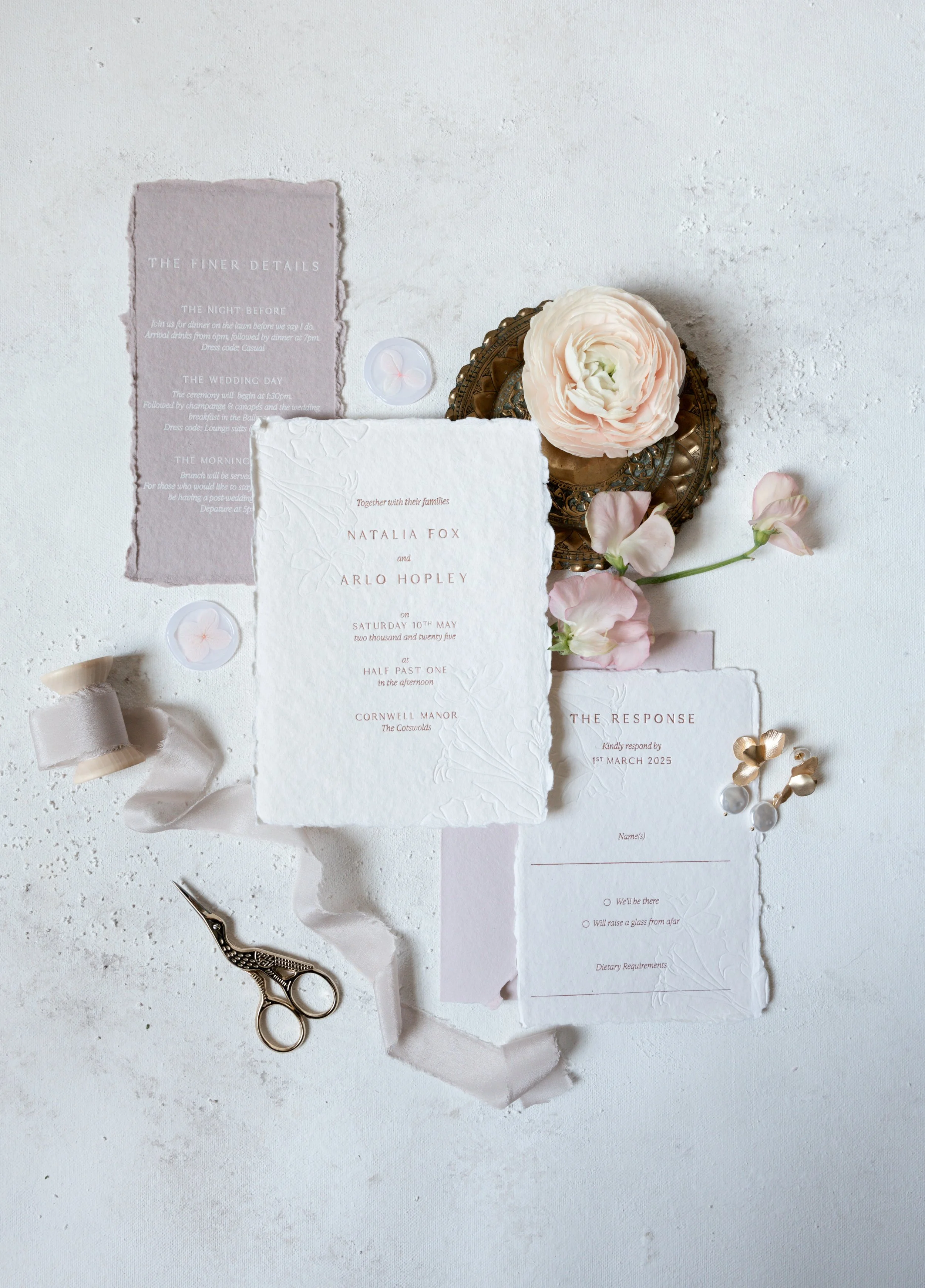
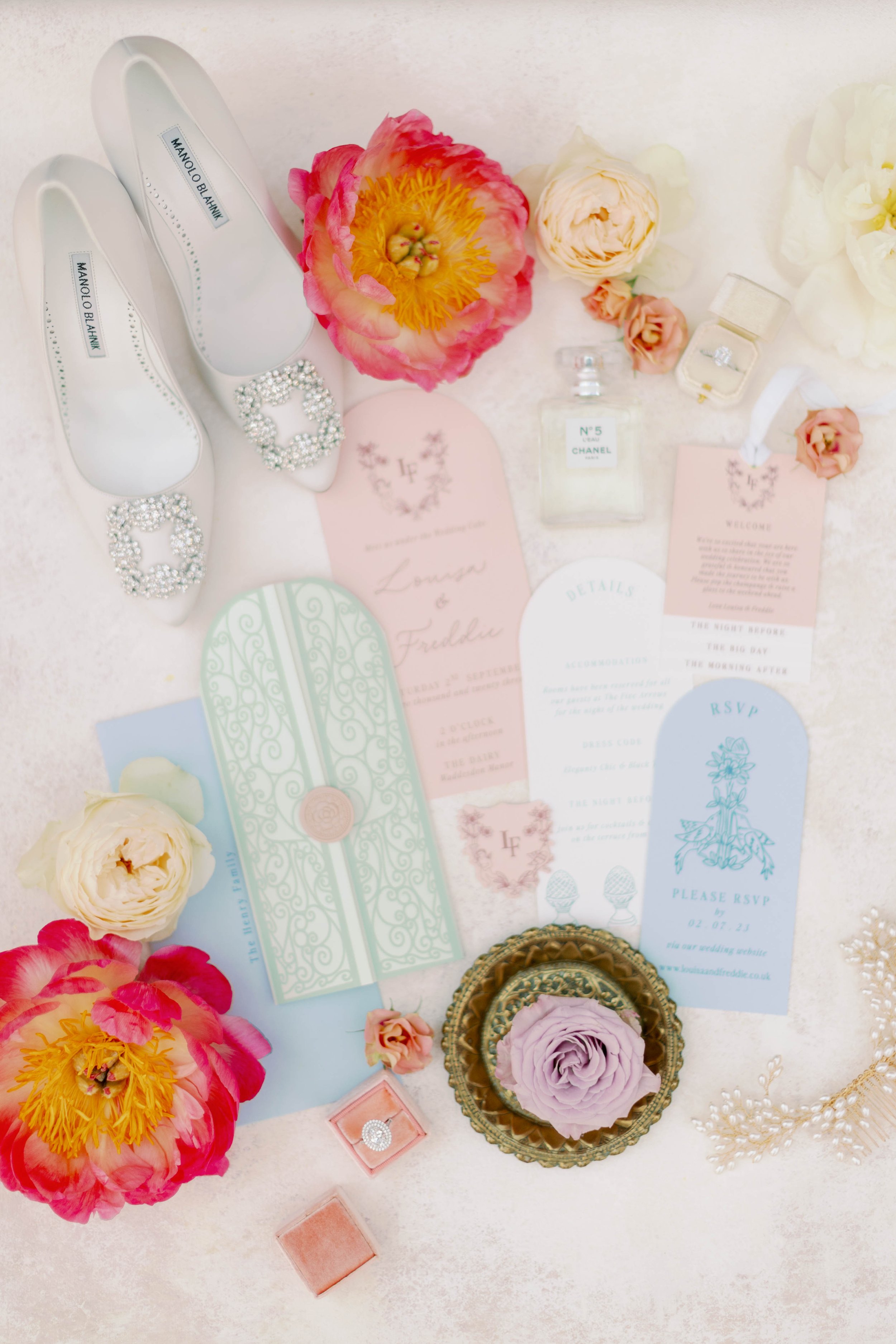
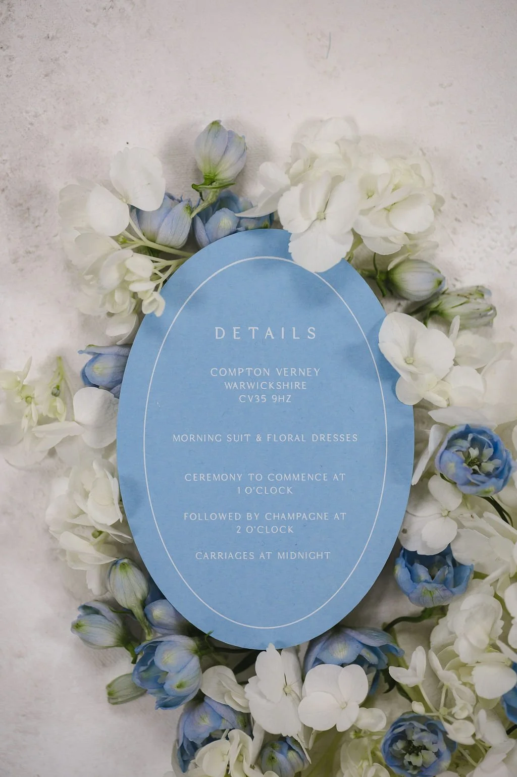
Wedding invitations and stationery
Bridesmaid styling
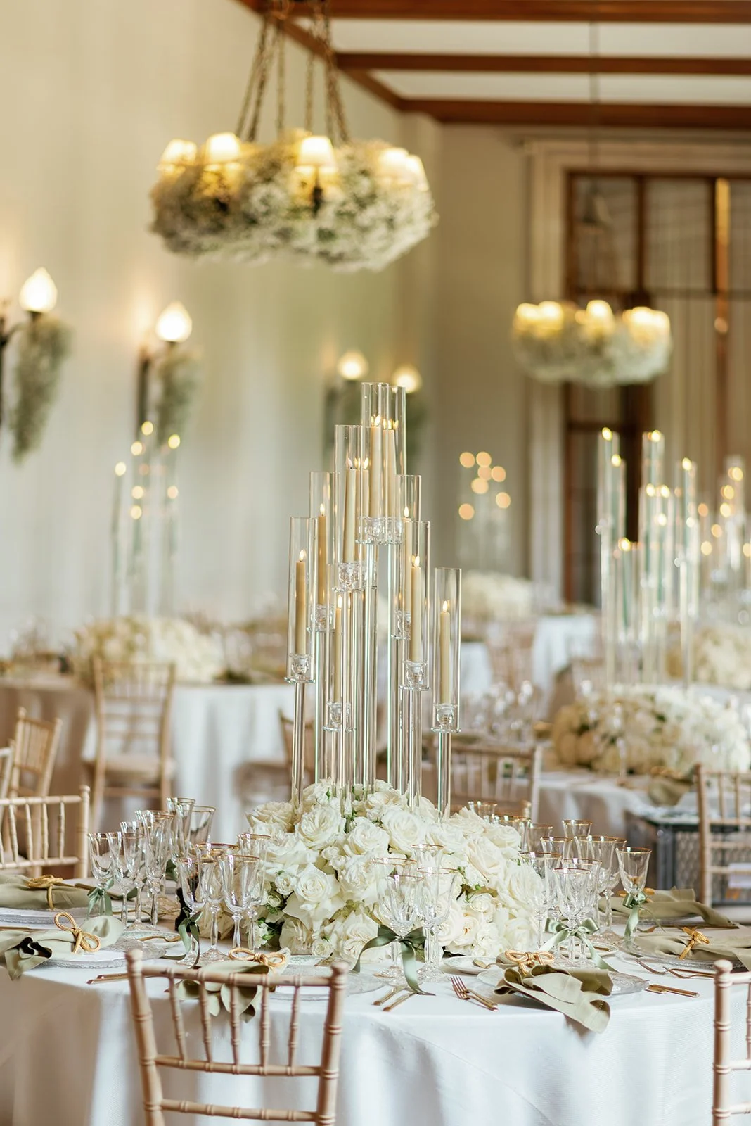
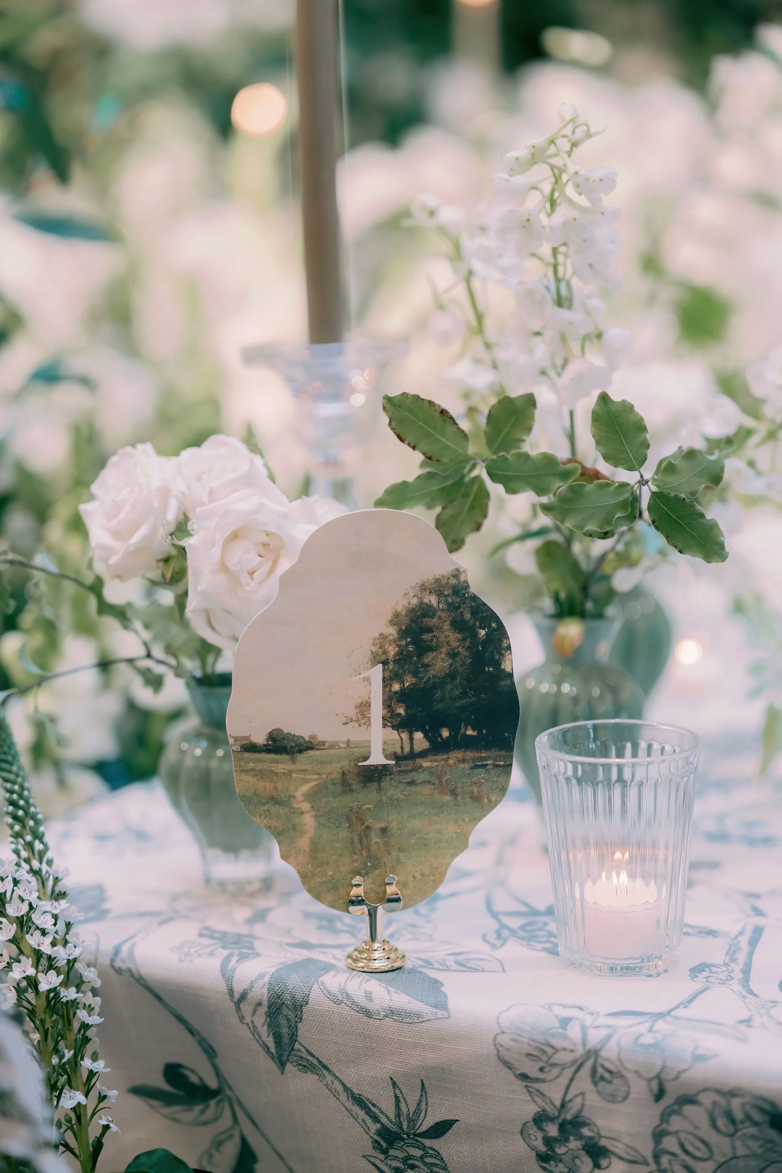
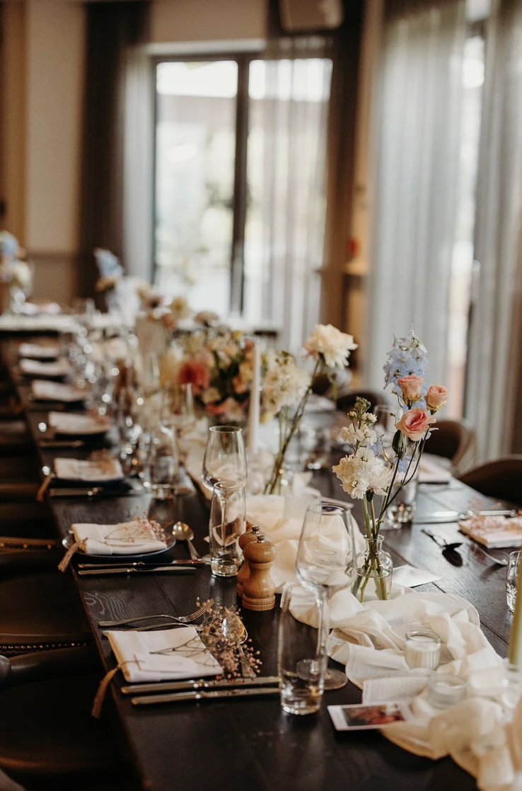
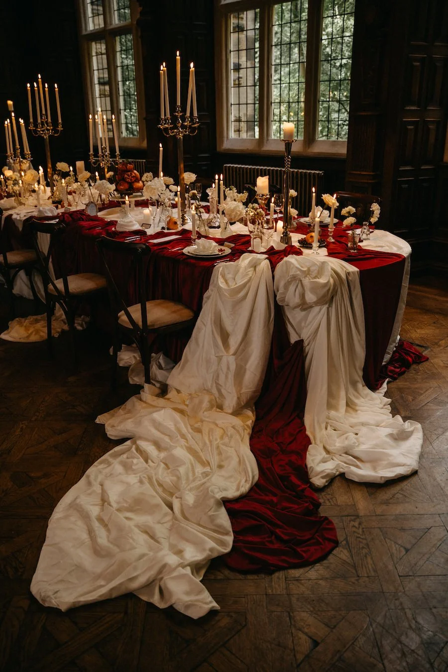
Tablescapes and linens
Floral arrangements
Candles, lighting, and signage
Texture and finish can completely transform a palette. An ivory invitation paired with silk ribbon, delicate blind embossing, or warm gold foil suddenly feels rich, layered, and beautifully considered.
Less Often Feels More Luxurious
The most elegant weddings rarely rely on colour alone. Instead, they focus on harmony, restraint, and thoughtful layering.
A soft tonal palette can feel incredibly impactful when every detail has been considered intentionally. Often, the most captivating weddings are the quietest ones, where texture, craftsmanship, and atmosphere speak louder than bold colour ever could.
Ultimately, your wedding colour palette should feel like a reflection of you, your story, your setting, and the atmosphere you want your guests to experience from the moment they open your invitation.